Content
The content section is all the space occupied by page below the toolbar and at the right of the menu. This section will changed based on the page currently navigated.
This session describes the frontend features, the user interface layout and the advanced table functions.
The frontend works with the latest two major versions of: Microsoft Edge, Google Chrome and Mozilla Firefox, and Apple Safari.
The frontend user interface have the following characteristics:
The beginner’s tour gives a step-by-step tour of the frontend user interface, highlighting the major layout elements.
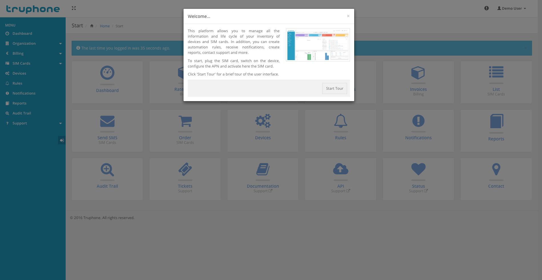
User interface tour.
Tip
The tour will start automatically on first time the user logs in into your account.
By using a responsive web design, all the web user interface of the platform is accessible via web browser or smartphone.
Dashboard home page in a web browser.
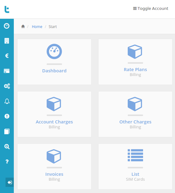
Dashboard home page in a smartphone.
Using the following icon, located in the upper toolbar, the user interface automatically changes to full-screen.

Dashboard full-screen button.
The platform uses graphs to show the reports (e.g. inventory, data or SMS usage, etc.). The graphs are responsive, they contain tooltips with the related information, you can activate or deactivate lines or bars you don’t want to see, the usage reports graphs also come with a line indicating the average usage per active SIM card.
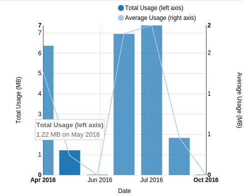
Data usage report with average line and showing the tooltip.
Several aspects of the frontend are customizable. To change, you need go to user Settings menu.
Among other, you can change the following options:
The platform web pages layout is organized in three different sections: Toolbars, Menu and Content.
By default, at the top of each page, you will find one or more toolbars.

Main header toolbar.
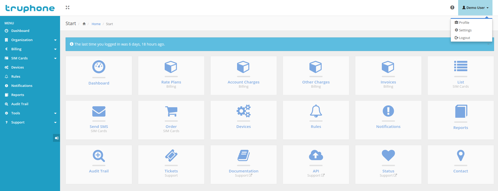
On the left-hand side, the main header toolbar allows you to minimize/restore sidebar or to switch to/from fullscreen. On the right-hand side, the main header toolbar allows to access the latest notifications or to open/close the account menu. In the user dropdown menu includes links to the user profile, user settings and to logout.
By default, on the left-hand side of each page, you will find the main menu.
Frontend main menu.
The menu includes links to all the sections of the platform. Note that the menu choices with an arrow on the right are actually a group of related links. The icon of the menu choice will change color when viewing a page of the section.
Tip
In smaller screens, the menu will reduce its horizontal size and will show only the icons. Hover the mouse over the icons to show the links of that group.
The menu can be completely hidden selection the left arrow at the bottom. To restore, you can click on the logo at the top.
The content section is all the space occupied by page below the toolbar and at the right of the menu. This section will changed based on the page currently navigated.
Some pages have too many elements to display at the same time. This way, tables are the best element to show them. The platform comes with s good table system, with features like:
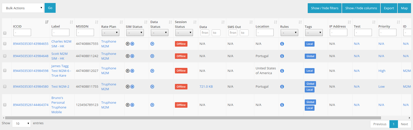
SIM card list view and the table associated.